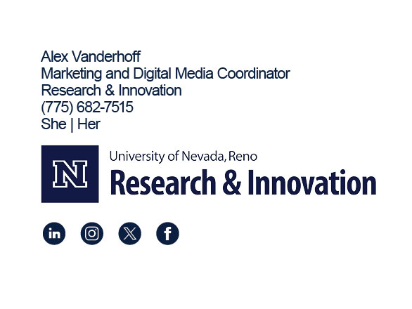
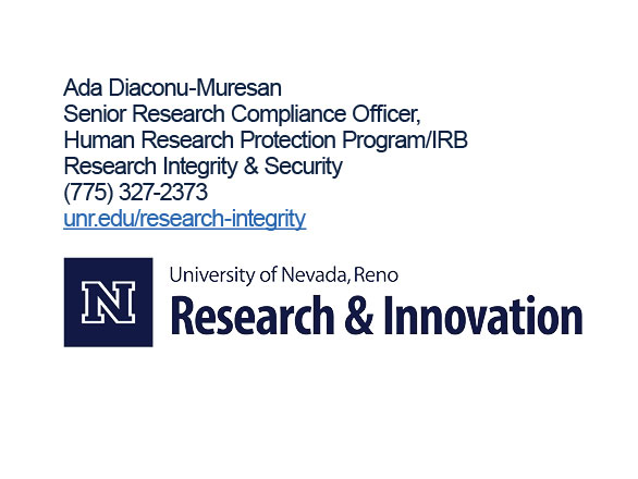
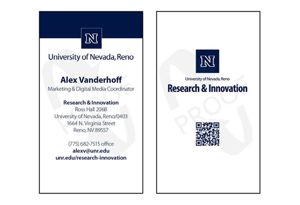
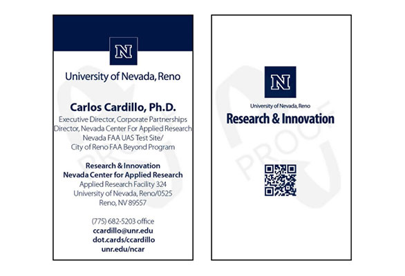
Overview of division logo usage and individual office/unit names
All materials (printed and digital) for the division will carry the Research & Innovation identifier (logo). Individual office/program names will all use the same fonts: Myriad Pro Light Condensed or Myriad Pro Bold Condensed, depending on the application. While this pertains to marketing and communications materials, effort will be made to carry this through to operational materials such as correspondence, documents and agendas.
Avoid the use of initials or acronyms when referring to your office/program—spell the words out whenever possible (ex. use Enterprise & Innovation, rather than E&I).
Please do not use “Office of” (ex. “Sponsored Projects” rather than “Office of Sponsored Projects”).
The only division unit name that will appear with the Block N is Research & Innovation (as shown in the logos below). Your office/program name will need to be separated from the division logo. Here are a few examples of this treatment:
Vehicle decals
An Environmental Health & Safety truck shows the division identifier on the driver and passenger side doors and, separated from the identifier, the office title with phone number and website URL is on both sides of the bed shell and uses the font style specified for division sub-units.
Brochure
A Sponsored Projects brochure shows the office title – using the font style specified for division sub-units – at the top of the page. The Research & Innovation division identifier appears at the bottom of the page, separated from the office title.
T-shirts
A Research Integrity & Security polo shirt shows the front and left-side views. The Research & Innovation division identifier is placed on the left-chest location of the shirt. The left-side view shows the Research Integrity & Security office name placed on the sleeve cuff of the shirt in the font style specified for division sub-units.