What is a brand? More than a logo, a brand encompasses all the ways an organization is recognized and experienced, from the perceptions it inspires to the stories it tells through its visual identity, voice and communications. The University of Nevada, Reno has deep history in Nevada as the state’s flagship institution of higher education, spanning 152 years to its founding in 1874.
Throughout its history, the University has evolved to reflect its growth and aspirations. On Oct. 20, during the 2026 State of the University address, the University will unveil the next evolution of its brand, one that honors its rich heritage while reflecting the excellence, innovation and impact that define the institution today and position it for continued success in the future.
Central to the new brand will be an updated visual identity system that serves as the foundation for the University's visual and verbal communications. The system includes logos, color palettes, typography, photography and editorial style, creating a cohesive framework for how the University presents itself across all audiences, digital mediums and communication platforms.
But a brand is more than its visual elements. A brand is the collective expression of an institution's reputation, values, culture and impact. It reflects how people experience the University and the connections they form with it. The new brand will reflect who the University is today, expressing the distinctive strengths, defining characteristics, aspirations and impact that set the institution apart. It will also reinforce the University's reputation for excellence while creating a stronger connection with current and future generations of the Wolf Pack.
The ancient Greek philosopher Heraclitus so eloquently stated, “Change is the only constant in life.” Change is an important part of the saga of the University and the update will reflect the next era for the institution. Before the University officially unveils the evolution of its brand, we look back at some of the iterations that have shaped Wolf Pack history.
Staying true to silver and blue
While some history is clearly marked, other eras and elements are a bit shrouded in mystery. One thing is true: The Wolf Pack runs silver and blue.
Founded in 1874, the University unveiled its first official yearbook in 1889 called the Artemisia, which gets its name from Latin genus name for Sagebrush, Artemisia tridentada. That yearbook had a blue cover and a decade later in 1899, the University officially adopted silver and blue as its colors.
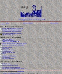 A screenshot showing the blue used on the University’s early website in the 1990s, from the blog post: “University website debuts true Nevada Blue” by former web development director Deaon Kolbet-Clausell.
While the colors silver and blue became official in the late 1800s, the exact shades of silver and blue have changed throughout the years.
The first blue used by the University may have been inspired by the color of the Union Army uniforms of the Civil War, and silver was an homage to the Comstock Lode. Of course, both silver and blue are also Nevada’s official state colors.
Silver and blue have consistently been part of the institution’s official branding, but the exact shades of those colors have varied over time, from deep navy hues to the electric blue featured in the University’s earliest website, launched in the mid-1990s.
Origins of the brand
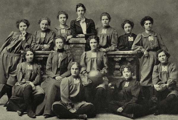
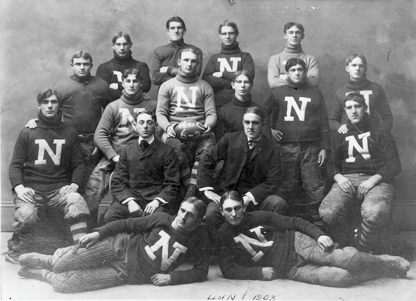
In the late 1800s, “N” and “U. N.” began to emerge as part of the University’s brand. From student publications like the U. of N. Sagebrush newspaper, and on various uniforms for athletics, these elements frequently appeared.

Women's basketball team, University of Nevada, 1898. Courtesy of University Archives. Nevada000128_WomensBasketball1898.tif collection_1402
Football team, University of Nevada, 1903. Courtesy of University Archives. UNRA-P135-1.tif collection_71.
In 1913, students painted the first Nevada “N” on Peavine Peak. That “N” has been an inspiration for many of the variations of the institution’s brand throughout the years.
 This undated photo shows a view of the "N" painted on Peavine Peak. (photographic print, 4.5 x 6.5 inches).
What’s in a name?
The University’s name has changed along with the visual identity. Founded in 1874 as the “State University of Nevada” in Elko, the University changed its name to the “University of Nevada” in 1906.
In 1951, due to a population boom in Las Vegas, the University of Nevada established an extension program in the south. In 1954, the Nevada Board of Regents established the “Southern Regional Division of the University of Nevada,” which eventually became its own campus with its own identity, UNLV, in 1957.
In 1969, the University of Nevada changed its official name to “University of Nevada, Reno,” distinguishing it from the southern institution on a national stage.
The institution continues to use that name, along with “Nevada” as a shorthand when referencing the athletics teams, or as a nod to its history as the state’s flagship and original land-grant institution.
A cloudy era of logo changes
While there is no official record documenting each of the University’s logos during the decades leading up to the late 1990s to early 2000s, historical photos showcase a myriad of logos, mascots and branding elements during those years.
A more concrete brand presence began to take shape in 1998 when the institution formalized rules surrounding use of the “name, insignia, seal, logo or other indicia” in the University Administrative Manual. That statement indicates that a formal logo system existed, even if the specific, official logo was not on record at that time.
Clues from the internet: History of the University’s website
The free, online web archive, The Wayback Machine, provides some insights into what brand elements may have been leading up to an official rebrand that occurred in 2006. Below are a few of the marks, artwork and logos found on the University’s website.
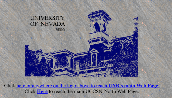
A screenshot from the University’s website in 1997 features a wordmark and depiction of Morrill Hall.
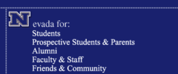
A screenshot from the University’s website in the early 2000s using an “N” logo as part of the main navigation menu.
A screenshot from the University’s website in 2001 showing a separate, wolf-focused mark specifically for athletics.

A screenshot of the header from the University’s website in 2001 is a variation of the wordmark and depiction of Morrill Hall seen earlier in the late 1990s.
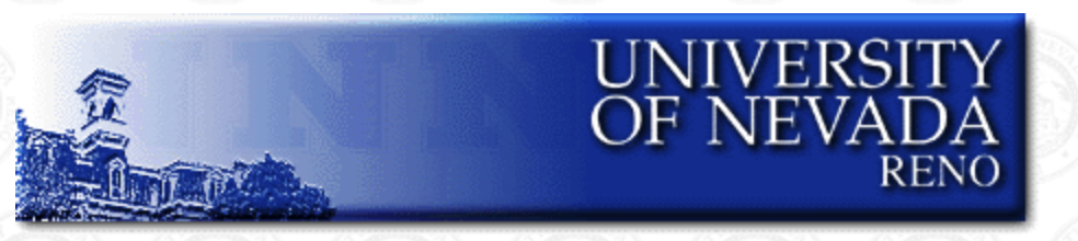
A screenshot of the University’s website from 2003. The background image changed throughout the years during this era, but the wording style of the University’s name remained the same.
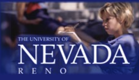
A screenshot from the University’s website in 2006, just before the unveiling of the block N logo system.

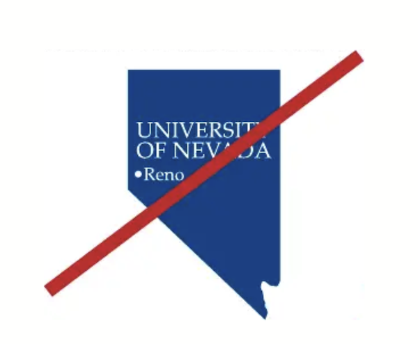
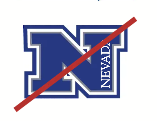
While the University’s early websites provide insight into its evolving visual identity, they do not capture every logo, mark or piece of artwork used during that period. Another clue into the visual identity from that time comes from a brand style and standards guide published in 2008, which highlighted two logos that were being retired.
Those marks included a Nevada state outline with a dot showing Reno, and a Nevada N with the word Nevada placed vertically along an edge.
The block N
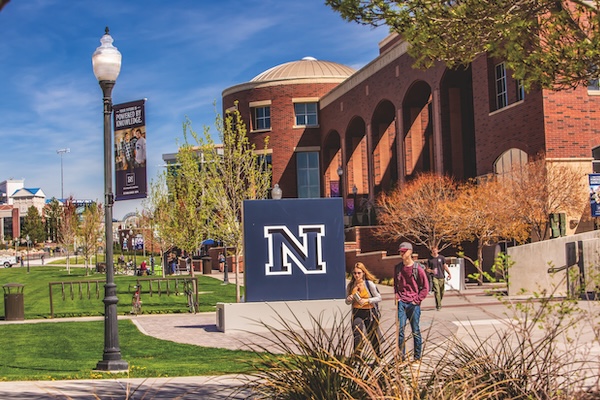
Perhaps the best documented representation of the brand was the creation of the “block N” logo created in 2006, which is still in use in 2026.
Developed by the marketing agency RhinoHub, led by creative director Mark Curtis and designer and partner Ronnie Parker, the block N logo was announced in the Winter 2007 edition of Nevada Silver & Blue magazine. It was referenced and revered by former University of Nevada, Reno creative director David Branby in a blog post in 2018, showcasing the lasting impact the block N had in relation to the University’s brand.
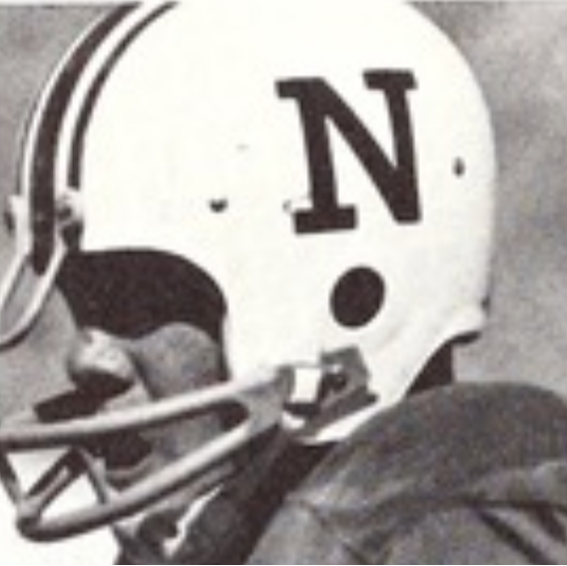
According to Parker, development of the block N took about two years of work. Before the block N, departments across the University were allowed to create their own logos and the brand had been diluted. The block N aimed to fix that and bring a cohesive authority and awareness back to the institution. Parker said the block N was inspired by a photo of an old Nevada football helmet that had a sans serif font “N” on it. That nod to the historic N won out over hundreds of other options the agency had worked through.
After adoption of the block N, a Comprehensive Graphic Standards & Style Guide was published in 2008, with guidelines on block N logo use, “signatures,” (which are basically secondary marks for colleges, schools and units,) fonts, colors, web standards, writing style and more, and the UAM was updated in 2010 to reflect that “the Block N logo is the core element of the graphic identity program, and it should appear on all university communications.”
A wolf in sagehen’s clothing
In a Nevada Today article from 2024, author Leslie Bruce recounted a story originally published in the U. of N. Sagebrush newspaper in 1922 that examined the University’s mascot. The article details how the University of Nevada pivoted from the Sagebrushers or Sagehens to the Wolf Pack, which better reflected “Nevada’s fight and do-or-die determination” that the athletics programs had already become known for, and, in 1923 the Wolf Pack became the University’s mascot, making the change official.
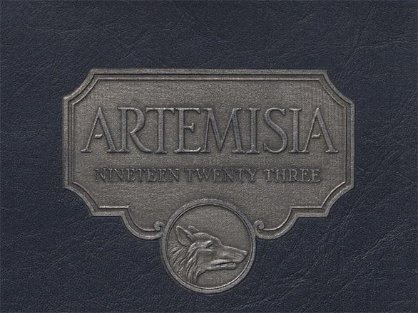
The wolf became a staple of Nevada Athletics through the decades.
Athletics marks and logos
Before the Sport Wolf that is in use today, Nevada Athletics played with the visual representation of the Wolf Pack.

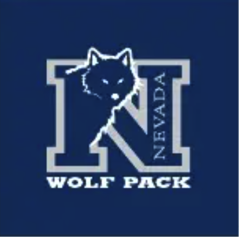
In 2001, the Sport Wolf was unveiled after then athletic director Chris Ault requested that the mark be a wolf that was “Not too mean or too nice,” as noted in this article from the Reno Gazette Journal, courtesy of ProQuest from the University Libraries. The Sport Wolf was released in conjunction with the block N with the wolf’s head as a secondary mark.
The secondary mark of the N with the wolf head was updated in the 2008 standards and style guide. Now called a “Wolf Pack Signature,” which was not an official logo. The mark was authorized by the University to be used in specific cases for branding, and was to be used by Nevada Intercollegiate Athletics exclusively.
Also outlined in that style guide was the “Top Hat Wolf” artwork, which had been used throughout the University’s history in various forms and expressions. The standards and style guide made the Top Hat Wolf artwork official, detailing how it was to be used, with which colors, and on what types of materials. It too was an update to the Top Hat Wolf, originally created in the 1920s.
Original Top Hat Wolf from the early 1920s, courtesy of University Archives Wolf Pack Mascot Art and Logos Collection, AC 0559.
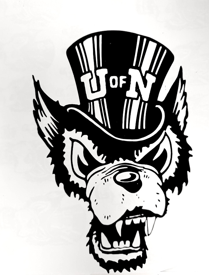
The updated Top Hat Wolf from the 2008 standards and style guide.
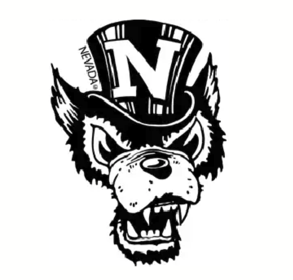
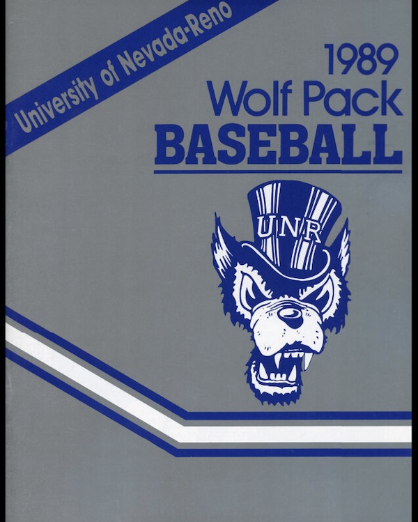
This Nevada Baseball program from 1989 shows how the Top Hat Wolf had appeared in various forms throughout the history of the University.
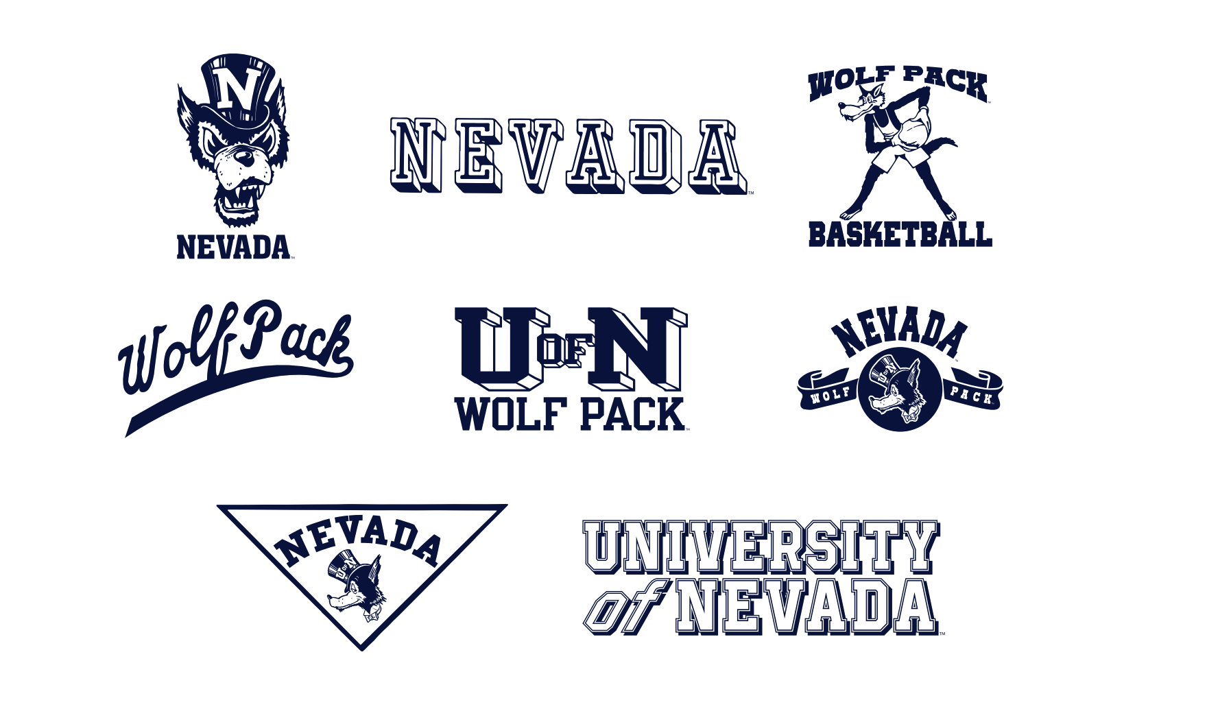
In 2023, Nevada Athletics published the Nevada Athletics Brand Guidelines & Visual Identity, which contained images of vintage marks, along with the brand identity system for Nevada Athletics.
For a more comprehensive history of the University’s mascot art and logos, please see the University Libraries collection available: Wolf Pack Mascot Art and Logos.
Worth noting about the University’s mascot: Nevada has three mascots in active duty today, including Alphie, Wolfie Jr. and Luna. Why? Because the Wolf Pack is just that – a Pack. As Rudyard Kipling’s “The Law of the Jungle” goes, “For the strength of the Pack is the Wolf, and the strength of the Wolf is the Pack.” No wolf must stand alone.
What’s coming next?
On Oct. 20, 2026, during the State of the University address in the new Wolf Pack Fieldhouse, the University will unveil its new brand identity. No matter what the brand evolution will be, Wolf Pack blood runs silver and blue and the brand will honor its 152-year history, while reflecting the excellence, innovation and impact that define the University today. Stay tuned!


