University website debuts true Nevada Blue
Web Development Director Deaon Kolbet-Clausell discusses the new Nevada Blue and shows upcoming changes to website navigation
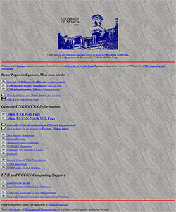 Royal blue, Reflex blue, Navy blue, dark blue: The University of Nevada, Reno website has had various shades of blue since the site originally launched in the mid-1990s. Today, University Marketing and Communications (MarCom) has introduced one blue to rule them all: Nevada Blue.
The origins of our school colors are somewhat shrouded in mystery, but a small Nevada flag from the late 1800s in Legacy Hall may hold the key. Legend has it that our official dark blue color harkens back to the color of the Union Army uniforms in the Civil War, the time during which Nevada was admitted to the union as the nation’s 36th state. Silver, of course, our secondary color, is a salute to the riches of the Comstock Lode and is the state color of Nevada.
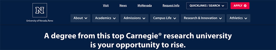
In MarCom, we would often get questions about why Nevada sports and fan apparel, for example, is a different blue than what’s found on our website. Today, with the introduction of Nevada Blue, we have aligned our physical, digital, and web colors to be consistent across the board. What’s more, Nevada Blue is a much richer blue that allows for a greater color contrast on our web pages, which is good for the sight-impaired as much as it aligns better with our school colors.
The current website look and feel launched on February 20, 2019, and I didn’t think it could get any better. We had a more modern website, that was the most accessible website we had ever had. The new website was easier to update, more robust, and looked amazing. This past March, we started applying Nevada Blue to our test environment, and the result was amazing. We found Nevada Blue truly remarkable in that it brought new life to our content. With a greater color contrast, the words stood out more. Nevada Blue allowed our images to pop. Nevada Blue made the University website stand up to the best higher education websites in the nation.
Along with Nevada Blue and Nevada Silver, MarCom will introduce new color splashes for 2021-2022. We love blue. We use it a lot on the web as it looks great. With the use of blue, however, we have also found the excitement on our website is sometimes diminished. After research, our web development team chose a selection of three bright colors that will soon start appearing on our website. This fall, we will introduce Sierra Sunrise, which captures the gorgeous skies we see during the fall and spring semesters. Tahoe Twilight captures the beautiful night sky in Northern Nevada. And Alpine Lake captures the magnificent lake colors of our favorite lake located just 45 minutes from campus. Look for these colors to start appearing this fall semester.
New colors are not the only updates coming, this fall, MarCom will also introduce updates to the navigation. We received constructive feedback from the University community. Although the navigation works well, the new update will bring information out of hiding and make it more readily available.
None of the work would be possible without our talented web development team— Andrea Farnsworth, Oswaldo Mendoza and Raymond Lee and the University Creative Director, David Branby. These talented folks have worked very hard over the past several months to align the look and feel of the University website with the overall University brand and visual identity, ensure greater accessibility and deliver on our promise that access to education and knowledge is essential to human progress.