The John and Geraldine Lilley Museum of Art at the University of Nevada, Reno is getting a refreshed brand identity. Since the museum’s renaissance in 2019 with the debut of the new University Arts Building, The Lilley has attempted to evolve from its contemporary art gallery roots. Now, after months of planning and design, The Lilley is proud to share its new, modern identity.
Recent graduate of the graphic design program in the College of Liberal Arts Ace Deems Pascual designed The Lilley’s new brand identity. Careful to not disconnect from the University, Pascual was challenged with designing a brand identity that sets the museum up as a unique creative entity on campus and in the community.
Pascual was a graphic design student in the BFA art program at the time and completed the brand identity design project as part of an independent study course. Assistant Professor of Art and Director of Graphic Design Monica Maccaux mentored Pascual as they treated The Lilley as a client and the project as an internship exercise.
“I went through the whole process discussing ideas and creating mockups and presentations on the new rebranding,” Pascual said.
Pascual learned their design skills while studying graphic design and art history. They were incredibly grateful for the mentorship Maccaux provided during their academic career.
In the early stages of the project, Pascual began the creative process by discussing the mission of The Lilley and the significance of the building in which the museum is located. The Director of the Museum, Vivian Zavataro, indicated the importance of showcasing women who are underrepresented in the art community. Pascual then researched women designers and presented a woman-designed typeface. After several iterations, the brand identity concept came to fruition.
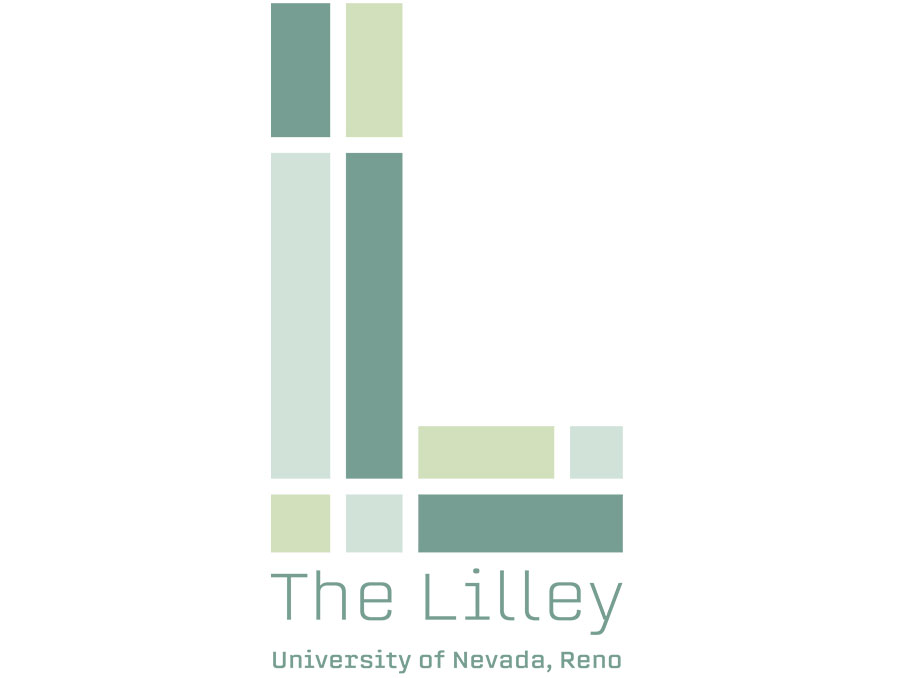
“The L in my design was made to emulate the reflection in the glass on the building,” Pascual said. ;“The shades mimic the light passing through the glass. The glass is significant because it was part of the expansion from Church Fine Arts to The Lilley.”
Even the colors used in the design were specific to the project.
“The soft sage color pallet was chosen to be inclusive to all genders, which is important to me, being nonbinary. I also wanted to give a nod to femininity that is so often disregarded in corporate settings.”
“Every part of this brand identity was selected carefully to represent The Lilley,” Pascual said.
Zavataro hopes the campus and local community appreciates the new branding.
“I am incredibly proud and impressed with the design Ace Deems created,” Zavataro said. “The new brand identity is modern, clean and fresh, showing not only The Lilley’s potential but its ideals and mission.”
Zavataro was conscious of the fact The Lilley’s new brand identity might raise some eyebrows in the University community. She didn’t want to stray away from the University’s brand identity, but to incorporate it in a creative way similar to other university art museums around the country.
“I am confident that our new brand identity will give us the opportunity to keep moving forward and present ourselves as this new and exciting museum that is here not only for our students and faculty, but to our community at large,” Zavataro said.


