Component overview
Photo Galleries provide a way to display a number of large images with captions for users to click through.
- Photo Gallery components can be used on all page schemas: Photo Gallery components may be used on Section Fronts, Section Detail, Profile Detail and Degree Detail pages.
- Provide descriptive captions for your images: The Photo Gallery requires a caption for each image. You can use this space to provide context about the images and explain to the user how the image represents our campus, your unit, etc.
- Be mindful of the number of images you use: Selecting top images often results in greater engagement then uploading all your images. The Office of Marketing & Commmunications can provide data on gallery engagement to help you optimize your image choices.
- Photo Gallery images must have a caption: A descriptive text is required in Photo Gallery Item components.
Photo Gallery images can vary in dimensions. The Photo Gallery container can be configured to use a 16:9 or 4:3 aspect ratio.
- Default: Images are placed in a 16:9 container. Common 16:9 image sizes are: 1280x720, 1920x1080.
- Enable 4:3 Aspect Ratio: Images are placed in a 4:3 container. Common 4:3 image sizes are: 640x480, 800x600, 1024x768, 1280x960 and 1600x1200.
- Crop To Fit: Individual images can be zoomed and cropped to fill the maximum space in the Photo Gallery container.
GALLERY: UNIT NAME - Purpose
- Example: GALLERY: VISIT - Campus Building
GALLERYITEM: UNIT NAME - Purpose
- Example: GALLERYITEM: VISIT - Ansari Business Building
Preserving history and culture
-
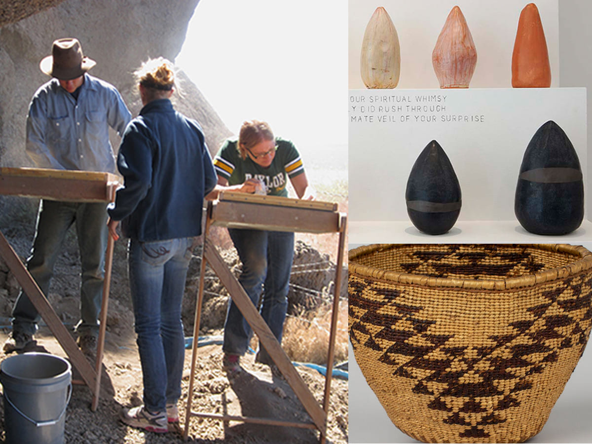
The Anthropology Research Museum on the 5th floor of Ansari Business is a teaching and research facility with archaeological artifacts and donated items from across the Great Basin. -
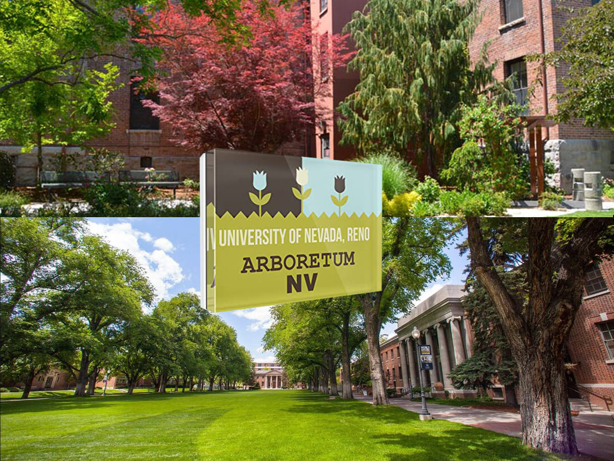
The entire 290-acre University campus is the University Arboretum – a living collection of plants, trees, shrubs, flowers, ornamentals and native flora with most designated areas open to the public. -
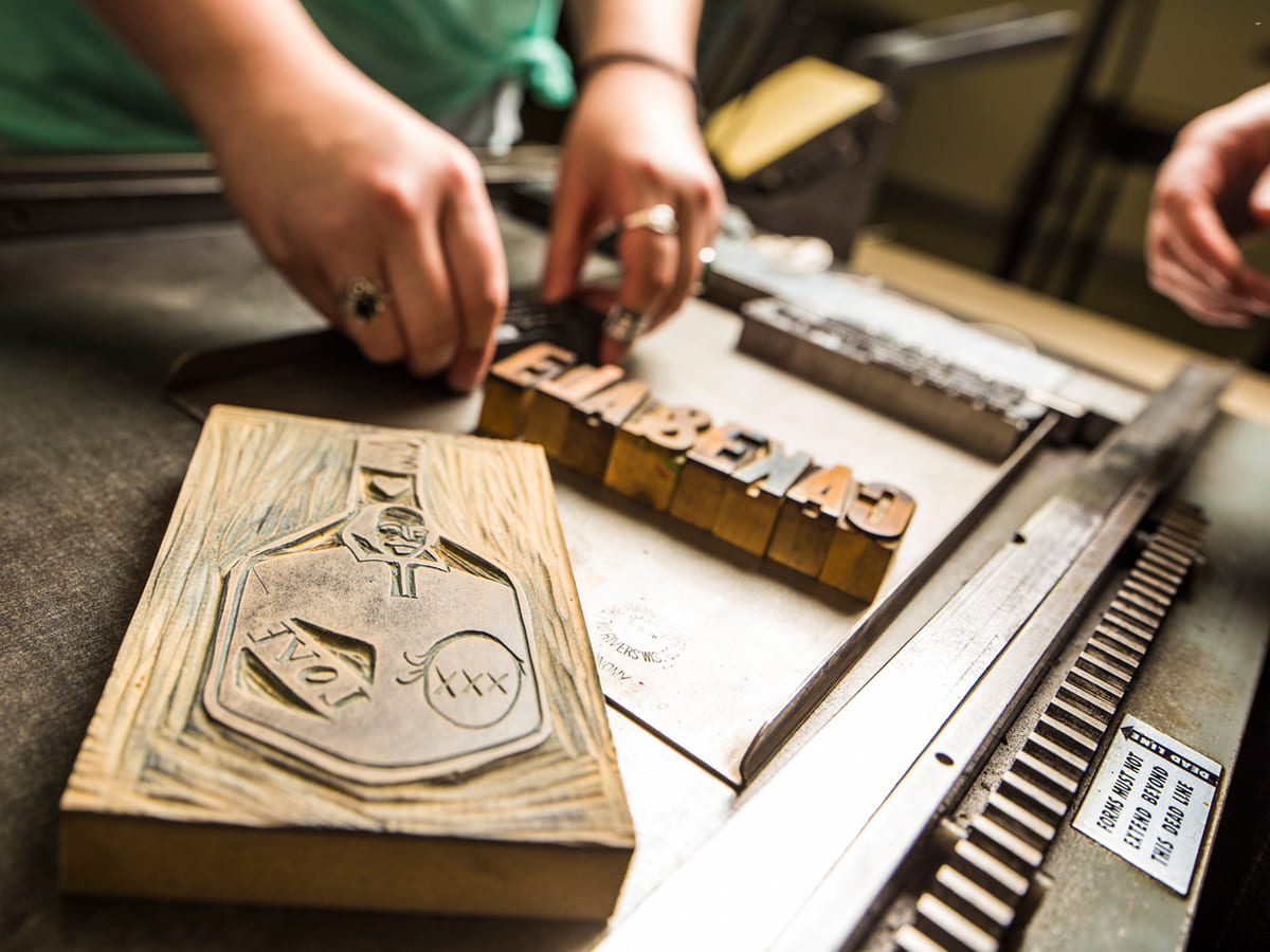
The Black Rock Press in the Church Fine Arts building is committed to advancing the art of the book while educating students about the book arts as both a historical and contemporary medium. -
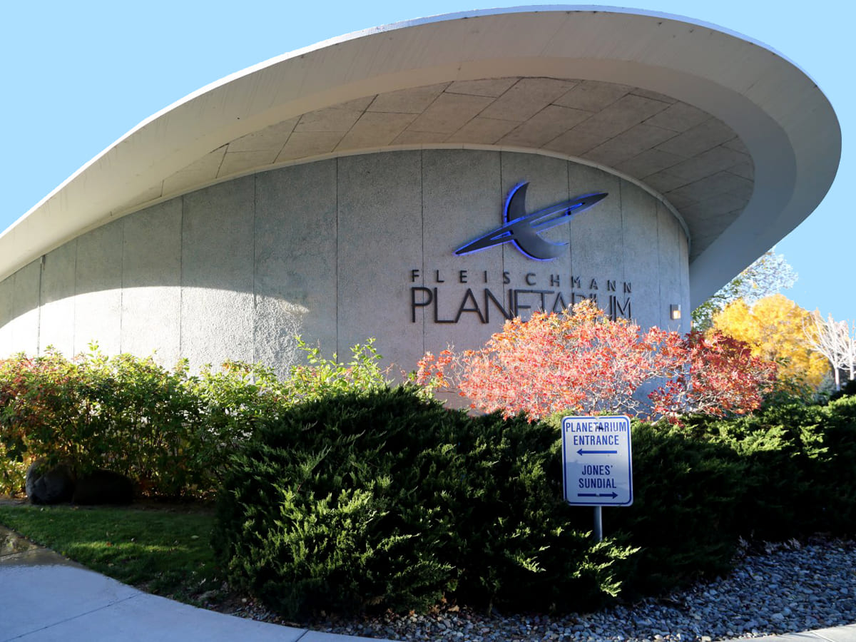
The Fleischmann Planetarium has educated millions of visitors and is a community resource for astronomy and earth and space science. -
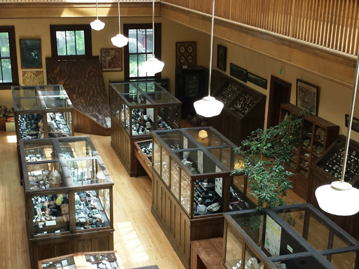
“The Keck” has been collecting and exhibiting Nevada's geology, paleontologyand mining history for more than 100 years. -
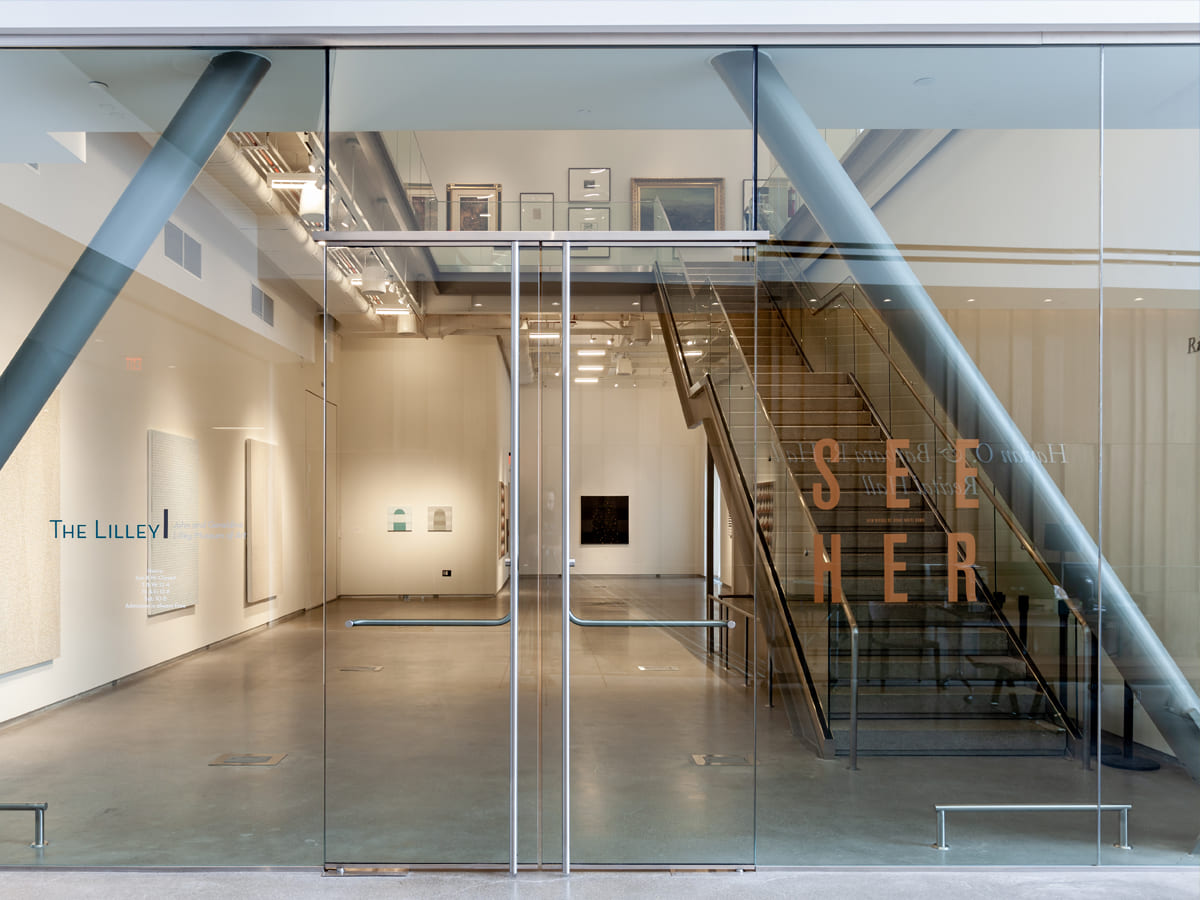
The John and Geraldine Lilley Museum of Art in the University Arts Building collects, conserves, exhibits and shares its research with art lovers from Nevada and beyond. -
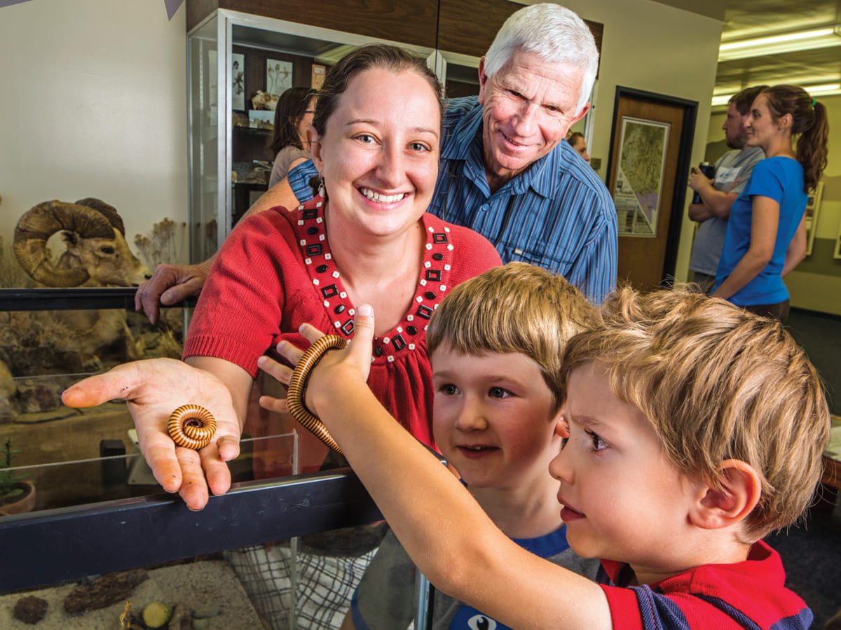
The Museum of Natural History showcases research and teaching collections of plants, local and tropical insects, mammals, birds, reptiles, and amphibians. -
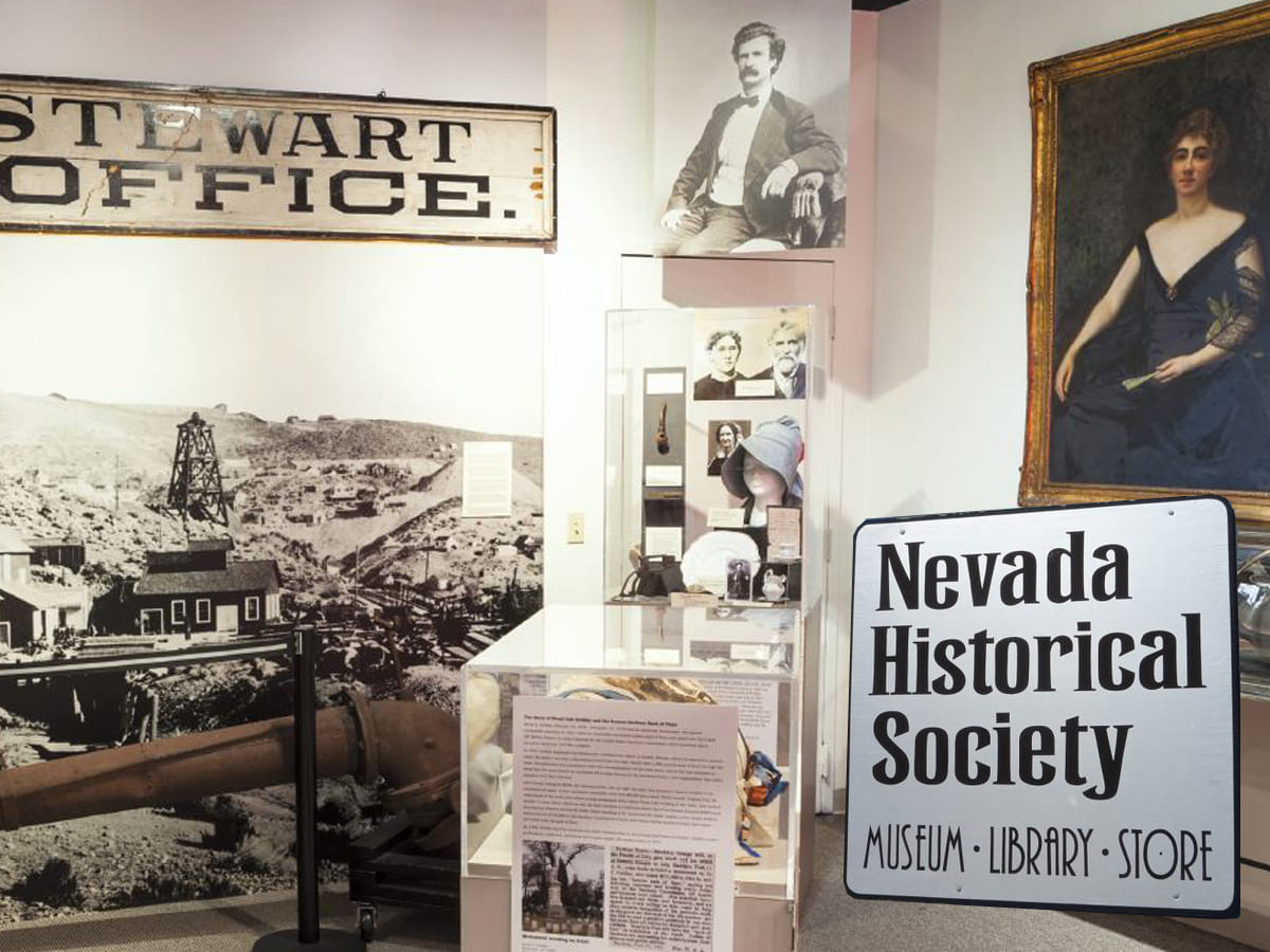
From boom to bust, Nevadans' stories are preserved at the Nevada Historical Society on the campus of the University of Nevada, Reno. -
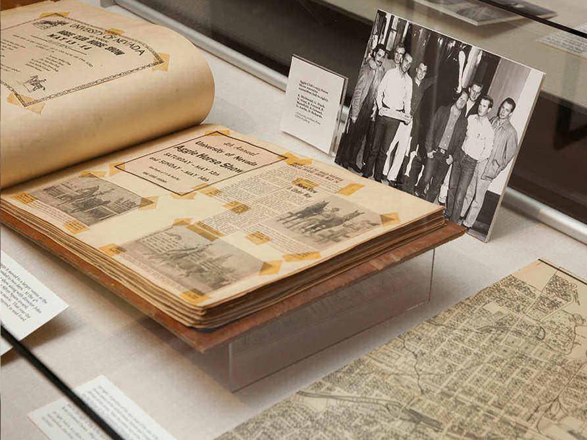
Special Collections and University Archives in the Mathewson-IGT KnowledgeCenter preserves and showcases rare items and important subject collections. -
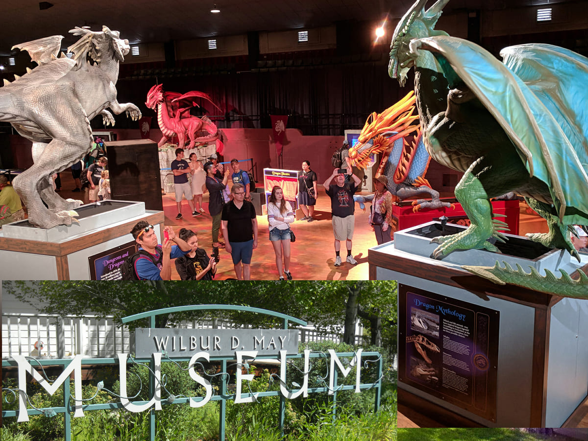
The Wilbur D. May Center in Rancho San Rafael Park near the University of Nevada, Reno features a museum, arboretum and botanical garden.