Typography

To maintain visual consistency and brand integrity across all touchpoints, always build with our official university typefaces. Selected for flexibility, hierarchy, and digital readability, our typography system ensures every communication carries our institutional story with purpose and clarity.

Uppercase and lowercase letter N typographic specimen in the Aleo slab-serif font rendered in light Nevada Silver on white.
Typography System

Presenting Your Message Visually

The content of your message is essential. Its visual presentation shapes how it’s received. The University’s brand typefaces were selected to balance tradition and approachability. Use the brand typefaces in all communications to keep the voice consistent.

When certain fonts aren’t available, such as in email, shared PowerPoint files or platforms that don’t support custom fonts, use Arial.
Typography

Primary Brand Typeface

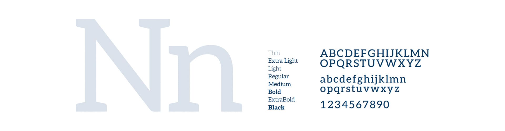
Aleo is the voice that leads. It's a sturdy slab serif with a confidence rooted in our history. But sturdy doesn't mean rigid. Its rounded details keep it warm and human, allowing it to speak with humble conviction. Aleo works well for attention-grabbing headlines, supporting subheads and short blocks of copy.

Aleo is our primary brand typeface.

Aleo brand typeface specimen banner divided into three sections: an oversized display of uppercase and lowercase 'Nn' in soft Nevada Silver showcasing slab-serif terminals on the left; a vertical center list of eight available weights ranging from Thin to Black; and a right-hand block displaying full uppercase A through Z, lowercase a through z, and numbers 1234567890 in bold navy text.

Typography

Secondary Brand Typeface

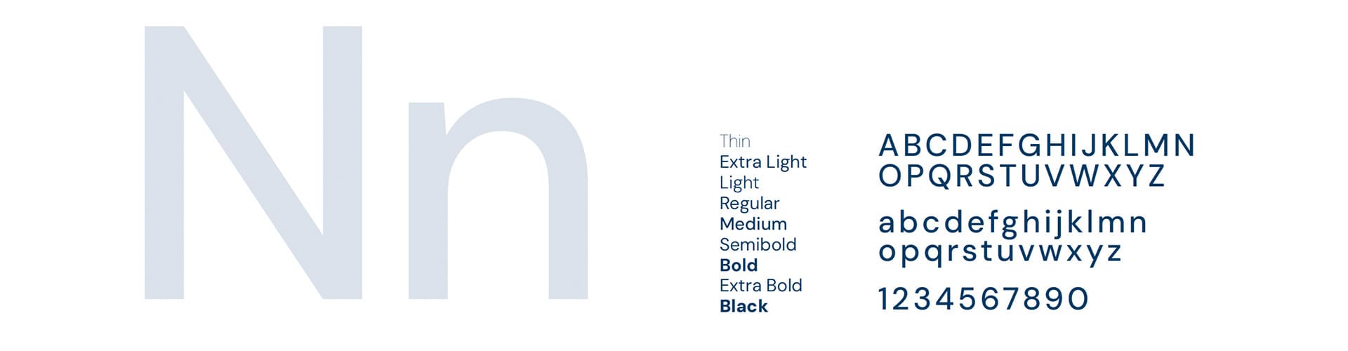
DM Sans is the voice that carries the conversation. It's a clean, open sans serif selected for its clarity and ease. DM Sans works well for body text and long-form documents, where readability matters. It also adds contrast in smaller typographic moments, like secondary titles and labels.

DM Sans is our secondary typeface.

DM Sans typeface specimen display showing three horizontal sections: a prominent, light silver 'Nn' letterform on the left illustrating the clean geometric sans-serif anatomy; a middle column listing nine progressive font weights from Thin to Black; and a right-hand block showing the complete uppercase and lowercase Latin alphabets alongside digits 0 through 9 in dark navy.

Typography

Select-Use Typeface

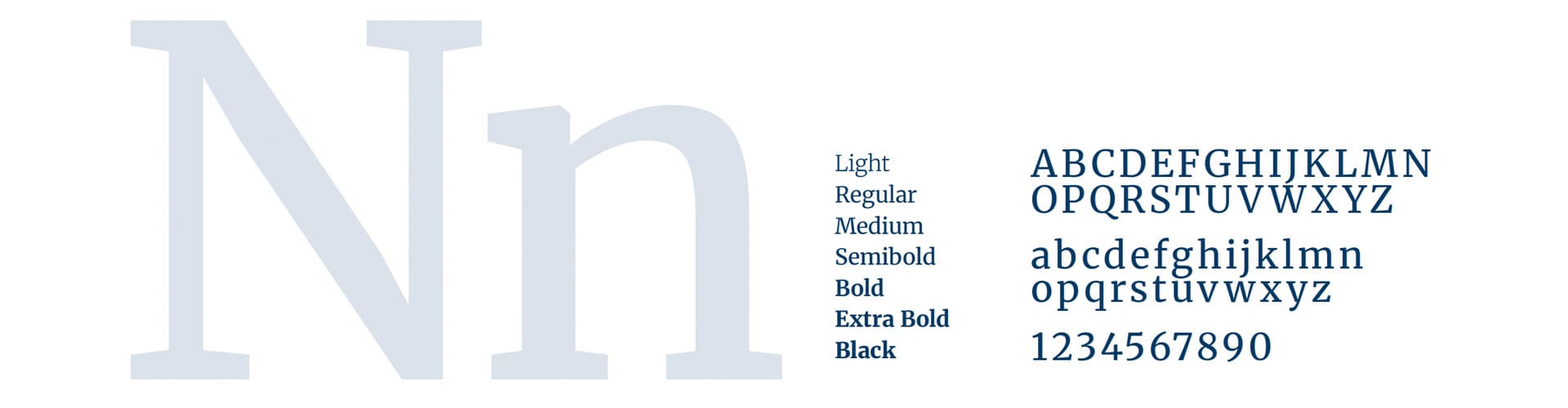
Merriweather is the voice for when we have more to say. It’s an editorial serif that brings an added level of polish to select communications, and pairs well with DM Sans. Merriweather is approved for select uses only.

Merriweather is a special-use typeface for select communications.

Merriweather font specimen graphic formatted in three horizontal zones: an oversized decorative 'Nn' glyph in light silver-gray on the left, a centered vertical column listing seven font weights from Light to Black with increasing visual thickness, and a right-aligned specimen block showcasing the full A-Z character set in uppercase and lowercase above numerals 1234567890 in dark navy serif lettering.

Up Next

Applying the Brand

Discover how our identity translates into everyday practice. From official stationery suites and print releases to dynamic environmental examples, explore how units across campus can bring the Nevada brand to life.