The University of Nevada, Reno unveiled a bold new institutional brand positioning initiative before an overflow crowd at the 2026 State of the University address on Oct. 20, 2026. The brand identity is rooted in the University’s more than 150 years of heritage and legacy while also giving it a fresh, collegial look, including a modern visual system, new logos and a dynamic brand campaign, “Where World Changers Get to Work,” that more clearly communicates who the University is and the value it brings to students, the state and society.
At its core, the “Nevada Brand” is the University’s reputation and tells an unforgettable story about its values, ambitions and impact as Nevada’s leading flagship, public land-grant university. The new, unified, cohesive brand platform is designed to highlight what makes the University different and aids in consistently sharing that story. Together, the elements help bring the distinctive strengths, ambitious vision and transformative impact to life for audiences in Nevada and beyond. The new brand identity is the product of an 18-month-long process conducted by the University that included extensive market research, testing of logo design concepts and development of strategic brand messaging.
Interlocked logo
Replacing the block N is the new custom-designed Interlocked logo – the letters U and N now interlocked as the primary logo. As Nevada’s flagship and original land-grant university, the Interlocked logo symbolizes the enduring foundation and spirit that has driven it since 1874. The logo has a feeling of authority, expertise and longevity. It is authentically rooted in heritage and legacy yet embodies a timeless and modern aesthetic to take the brand forward through the next 150 years.
The Interlocked logo is inspired by the University’s past, including the well-established University seal and historic typography, allowing the brand to feel familiar while being new.
Nevada has a nationally recognized and unique state silhouette. As the first university established in the state, the University’s logo contains that shape within the logo’s design. It incorporates the dynamic sense of movement in the strong northwest-to-southeast diagonal line of the state shape, and by interweaving the U and N, the iconic Nevada shape is revealed in an organic way.
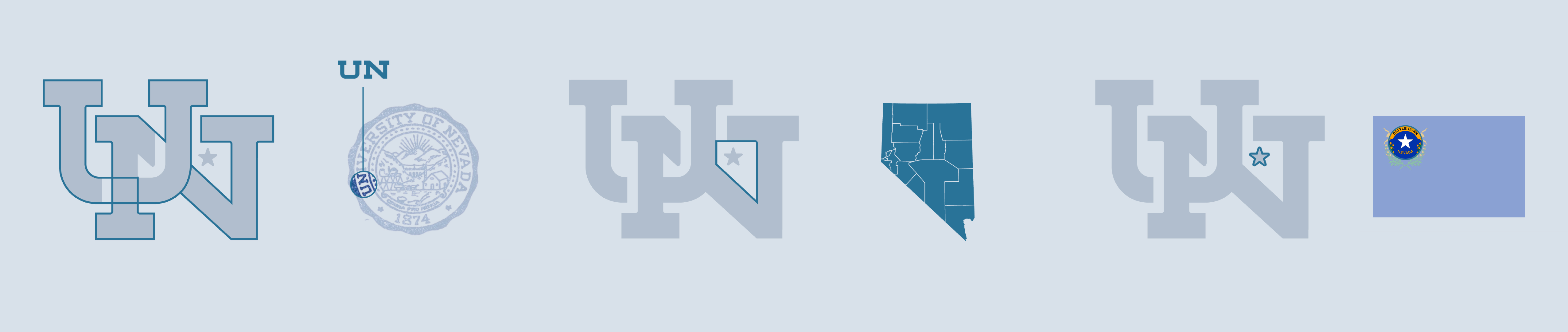
Embedded within the Interlocked logo is a star that pays tribute to the University’s home in Reno while providing a subtle geographic cue for audiences less familiar with Nevada. Together, these elements communicate both the University’s heritage and its forward-looking vision.
The Nevada Wolf
The Nevada Wolf, formerly known as the Sport Wolf, is the spirit logo (also custom-designed) and a new take on what the University has always been about: action, momentum and the power of belonging to The Wolf Pack.
The University has seen its fair share of wolf depictions through its history. Just as that Interlocked logo takes cues from the past to look to the future, this logo takes inspiration from its predecessors. The design is not about a fresh coat of paint or bowing to current trends. It is about the creation of an authentic symbol for the University of Nevada – one of pride, togetherness and momentum. A symbol that is not just about Athletics, but the spirit of the entire University. This logo might be new, but it feels familiar.
The primary spirit logo incorporates so much of what the University is about: every wolf needs its pack. A Nevada Wolf system was developed to help reinforce this idea and to create flexibility in the overall University branding so that the pack can always be present.
The Regal Trio features three wolves including a running trio, leaping trio, and standing trio representing the strength, unity and energy of the Wolf Pack. The Trio – Wolfie Jr., Luna and Alphie – reflects the vibrant and inclusive community of the University, one that welcomes individuals from all backgrounds, experiences and perspectives. It serves as a visual reminder of the connections that strengthen the Pack and the shared purpose that drives the Pack forward.
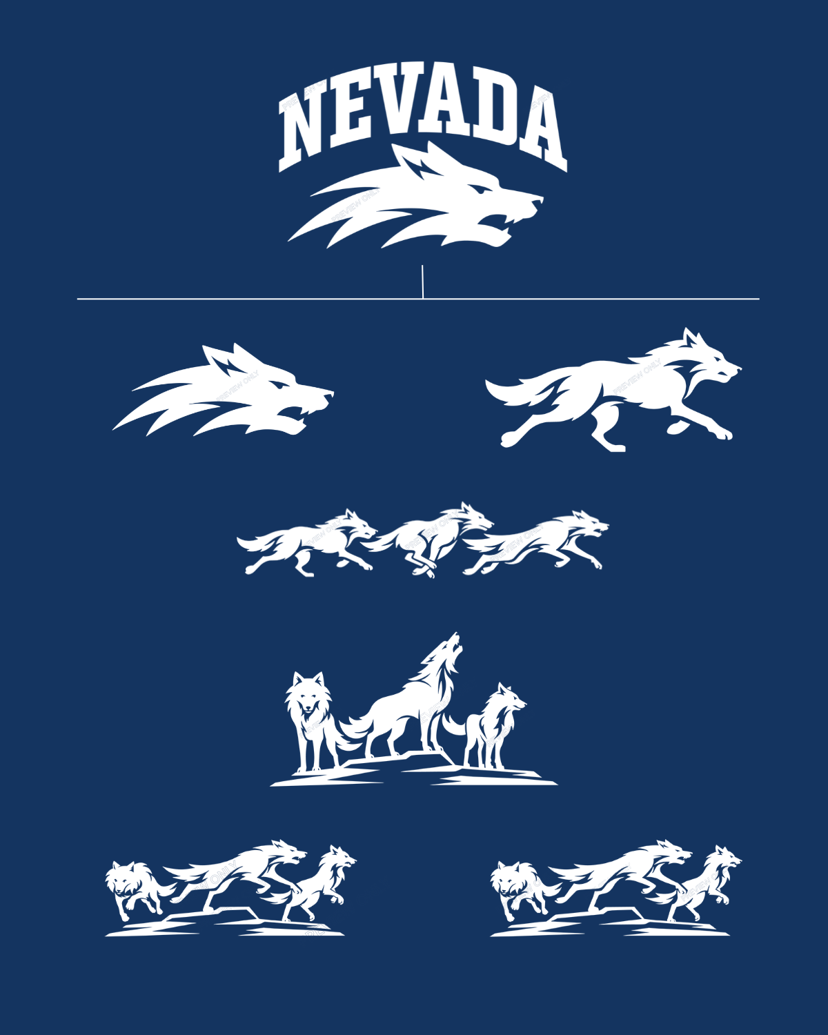 To support the Nevada Wolf mark, a Nevada Wolf System was developed to bring the University’s ethos of a pack to its visual identity.
The Interlocked logo is the symbol of institutional authority founded on a long history of excellence but timeless in both meaning and design.
The Nevada Wolf logo captures the spirit, energy and momentum of what is possible when you are part of the Pack.
While each logo serves a distinct purpose, they collectively form a unified visual identity, ensuring every achievement, experience and success story contributes to a stronger and more recognizable Nevada Brand. Two Logos. One Pack.
This is just the beginning
The new brand identity unveiled on Oct. 20 is the beginning of multi-year phased implementation across the institution beginning with high-visibility items such as recruitment materials and digital communications. The University’s old logos will be thoughtfully phased out incorporating updates for items on and off campus into normal replacement cycles whenever possible. At the same time, the “Where World Changers Get to Work” brand campaign will be introduced starting January 2027 in key, in-state and out-of-state recruitment markets to build and strengthen the University’s competitive position.


